I recently made a scatter plot of a UMAP for a manuscript and it bothered me that there was a lot of overplotting which made it hard to discern the structure of the data.
It turns out that ggplot2::geom_point has a neat parameter called stroke which can be set to zero and ensures that size is mapped accurately.
library(ggplot2)

# Create example data
data <- as.data.frame(rbind(mvtnorm::rmvnorm(n = 40000, sigma = diag(c(1, 1))),
                            mvtnorm::rmvnorm(n = 10000, sigma = diag(c(0.5, 0.01)))))

ggplot(data, aes(x = V1, y = V2)) +
    geom_point() +
    labs(title = "50,000 points produce a lot of overplotting") +
    coord_fixed(xlim = c(-3, 3), ylim = c(-3, 3))
I first tried to set the size a smaller value (size=0.0001), but it didn’t completely solve
ggplot(data, aes(x = V1, y = V2)) +
    geom_point(size = 0.0001) +
    labs(title = "Even very small point sizes don't completely fix the issue") +
    coord_fixed(xlim = c(-3, 3), ylim = c(-3, 3))
To make sure that the size argument is accurately displayed, set stroke = 0:
ggplot(data, aes(x = V1, y = V2)) +
    geom_point(size = 0.3, stroke = 0) +
    labs(title = "Setting `stroke  = 0` reveals the pattern") +
    coord_fixed(xlim = c(-3, 3), ylim = c(-3, 3))
Another way to see the problem, is to compare the points with a stroke (top and middle row) and without a stroke (bottom line) directly. The trick is that I use a shape (“circle filled”) that colors the border stroke in a separate color.
ggplot(data.frame(x = seq(0, 2, length.out = 30))) +
  geom_point(aes(x = x, y =  0.6, size = x), stroke = 1,   shape = "circle filled", fill = "black", color = "red") +
  geom_point(aes(x = x, y =    0, size = x), stroke = 0.3, shape = "circle filled", fill = "black", color = "red") +
  geom_point(aes(x = x, y = -0.6, size = x), stroke = 0,   shape = "circle filled", fill = "black", color = "red") +
  scale_size_identity() +
  lims(y = c(-1, 1)) +
  labs(title = "The row without a stroke vanishes")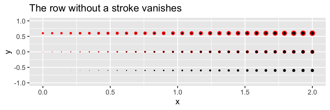
Updated 2023-06-09
In an early version of the post, I recommended setting shape = "circle filled" and color = "#00000000#" (transparent). This helped a bit, but still lead to a non-zero minimum point size